Image Quality Evaluation-Aberration Curves
1. Geometric Aberration Curves
1.1 Spherical Aberration Curve
Spherical aberration is a type of monochromatic aberration for axial points, where rays at different angles intersect the optical axis at various points after passing through a lens, deviating from the ideal image point.
In a spherical aberration curve, the vertical axis represents aperture, while the horizontal axis denotes spherical aberration (or chromatic spherical aberration).
When analyzing this curve, two key aspects require attention:
1) pay attention to the size of the spherical aberration.
2) pay attention to the shape of the curves, especially the degree of separation between multiple curves representing several colors of light
If a single curve is OK, but the distance between the curves is large, it indicates severe chromatism of position within the system.
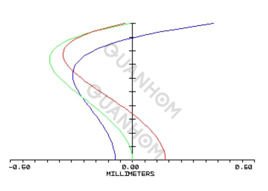
The increased distance of the three curves from the vertical axis indicates the presence of axial chromatic aberration and spherical aberration.
1.2 Off-Axis Aberration Curves
This typically consists of two separate graphs:
1) Left Graph: Displays the paraxial meridional field curvature XT’and paraxial sagittal field curvature XS’. If multiple working wavelengths are present, each wavelength's meridional and sagittal field curvatures will be shown individually.
2) Right Graph: Represents distortion.
Different colors indicate different colored light, T and S represent tangential and sagittal respectively. The distance between T and S of the same color indicates the astigmatism X'ts. Both graphs have the field of view as the vertical axis. In the left graph, the horizontal axis represents field curvature in mm, while in the right graph it represents distortion as a percentage. The spacing between curves of different colors in the left graph indicates chromatic aberration in magnification.
Distortion is a form of primary ray aberration and reflects the degree of similarity of the object image, if it is less than 1%, the object image is considered to be almost perfectly similar.
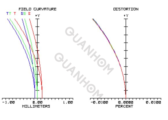
Meridional Planes:Any beam cross-section passing through the y-axis of the aperture;
Sagittal Planes: Any beam cross-section passing through the x-axis of the aperture.
2. Spot Diagram
A spot diagram is the shape distribution diagram of light on the image plane. When numerous rays from a single point source pass through an optical system. Due to aberrations, the intersection on the image plane is no longer concentrated in the same point, resulting in a dispersed pattern known as the spot diagram.
This corresponds to the imaging of a point source at a specific field position. That is, the imaging of a point light source at the image field position. Due to lens aberrations, an ideal point source cannot be reproduced as a perfect point. The imaging of an actual object can be viewed as the superposition of countless point sources, meaning the spot diagram directly reflects the actual imaging quality (on the focal plane). Spot diagrams are among the most commonly used evaluation methods in modern optical design.
1) Pay attention to values in the table below the diagram; smaller values indicate better image quality.
2) Analyze the shape of the distribution in the diagram to assess the impact of geometric aberrations in the system, such as notable astigmatism or coma characteristics, as well as the degree of separation of several color spots.
2.1 Analyze Chromatic Aberration
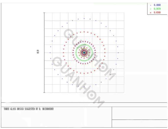
In the spot diagram for a 0° field (on-axis rays):
(1) If red, green, and blue spots do not overlap well, this suggests the presence of axial (on-axis) chromatic aberration.
(2) The presence of multiple circle of confusion indicates spherical aberration.
(3) Spot diagrams are primarily a tool to qualitatively assess which aberrations are more serious in the current optical path, rather than to measure aberrations quantitatively.
2.2 Analyze Coma
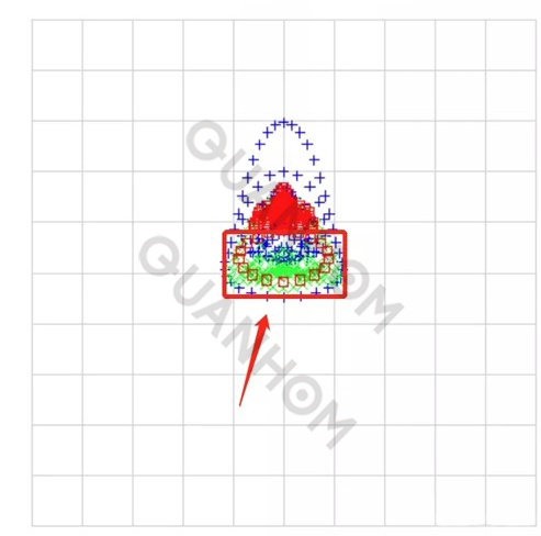
In the spot diagram for a 35°field (on-axis rays):
①Chromatic aberration is relatively small, with some increase in short-wave aberration, which is normal.
②The presence of "tails" in the red, green, and blue colors (marked in the figure) suggests its near the aperture edge for this field.
③This "tail" is called coma.
④There is indeed coma in the figure. To determine its severity, compare it against established quality standards.
2.3 Analyze Astigmatism
One method is to examine defocused spot diagrams. The center one is the spot diagram on the image plane, the left shows the diagram when the image plane is shifted left, and the right shows it when shifted right.
It can be seen that the spot on the image plane is an approximately elliptical shape; it appears as a vertically oriented wide ellipse on the left side of the image plane. And it appears as a horizontally oriented ellipse on the right side of the image plane indicating significant astigmatism within this range.

3. Transfer Function
Modulation Transfer Function (MTF):
The MTF is defined as the ratio of image contrast to object contrast at a given spatial frequency, reflecting the system’s ability to transfer different spatial frequencies and contrasts. In general, the high-frequency transfer function reflects the ability to transfer object details, low-frequency reflects the ability to transfer object contours, medium-frequency reflects the ability to transfer object levels.
The MTF chart of a lens provides a quantitative description of its resolving power(resolution), specifically quantifying image clarity, which includes both resolution and sharpness. Mathematically, MTF stands for Modulation Transfer Function.
3.1 MTF Curve
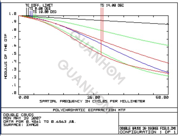
The colored curves in the chart represent the MTF for polychromatic (white) light at various field.
T and S indicate tangential(meridional) and sagittal directions respectively. The black curve at the top represents the diffraction limit. The horizontal axis shows spatial frequency in lp/mm (line pairs per millimeter), while the vertical axis represents contrast, with a maximum of 1. The higher the curve, the better the image quality.
3.2 Transfer Function and Defocus Relationship Curve
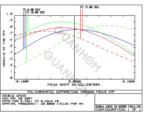
This curve illustrates the relationship between the meridional and sagittal MTF and the defocus for different FOV at a set spatial frequency.
The defocus curve shows MTF changes when the image plane deviates from its design position.
The horizontal axis represents the distance of deviation from the designed image plane, while the vertical axis shows the MTF value. The more the image plane deviates from the designed position, the greater the MTF drop.
This curve helps assess whether the optimal focal planes are consistent across field and how sensitive MTF is to defocus.
4. Ray Aberration Fan (Rayfan)
The Ray Aberration Fan, also known as(RayFan), shows the ray aberrations as a function of pupil coordinates and is a powerful tool for analyzing ray aberrations. And it illustrates all aberrations except distortion and is not limited to primary aberrations.
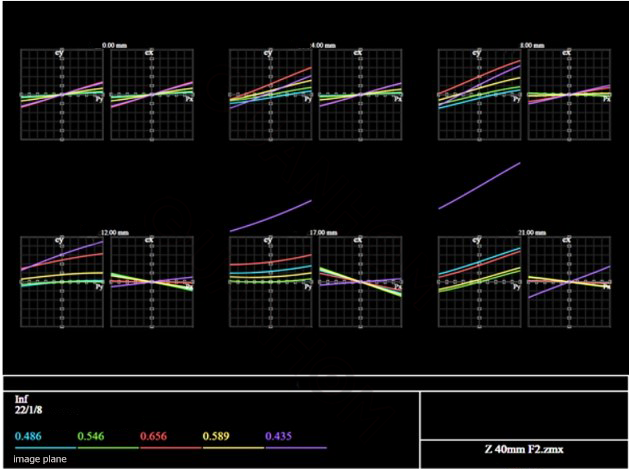
The RayFan shows how far a ray at a certain pupil position lands from the ideal point on the focal plane. The intercept on the vertical axis represents color dispersion of magnification.
In these diagrams, the horizontal axis represents the pupil, while the vertical axis indicates the actual width on the sensor. Each image field position has both tangential and sagittal diagrams.
For a lens without aberrations, the RayFan would be a straight line. The height of the curve reflects the aberration.
Defocus appears as a linear curve. Primary coma appears as a quadratic curve. Primary spherical aberration and sagittal coma appear as cubic curves. Actual lenses often show complex and irregular curves, representing a synthesis of the various types of aberrations from primary to higher order.
The slope of the line represents the degree of defocus. Naturally, the slope of rays of different colors indicates axial color dispersion. Differences in slope between the tangential and sagittal directions represent astigmatism; identical non-zero slopes indicate field curvature.

